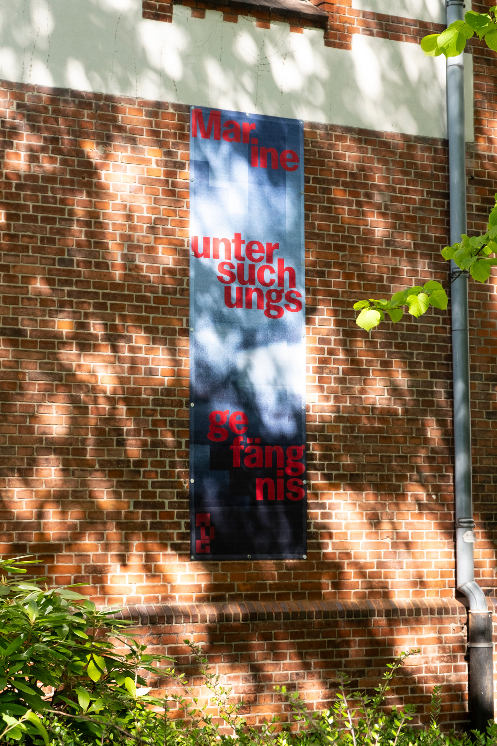
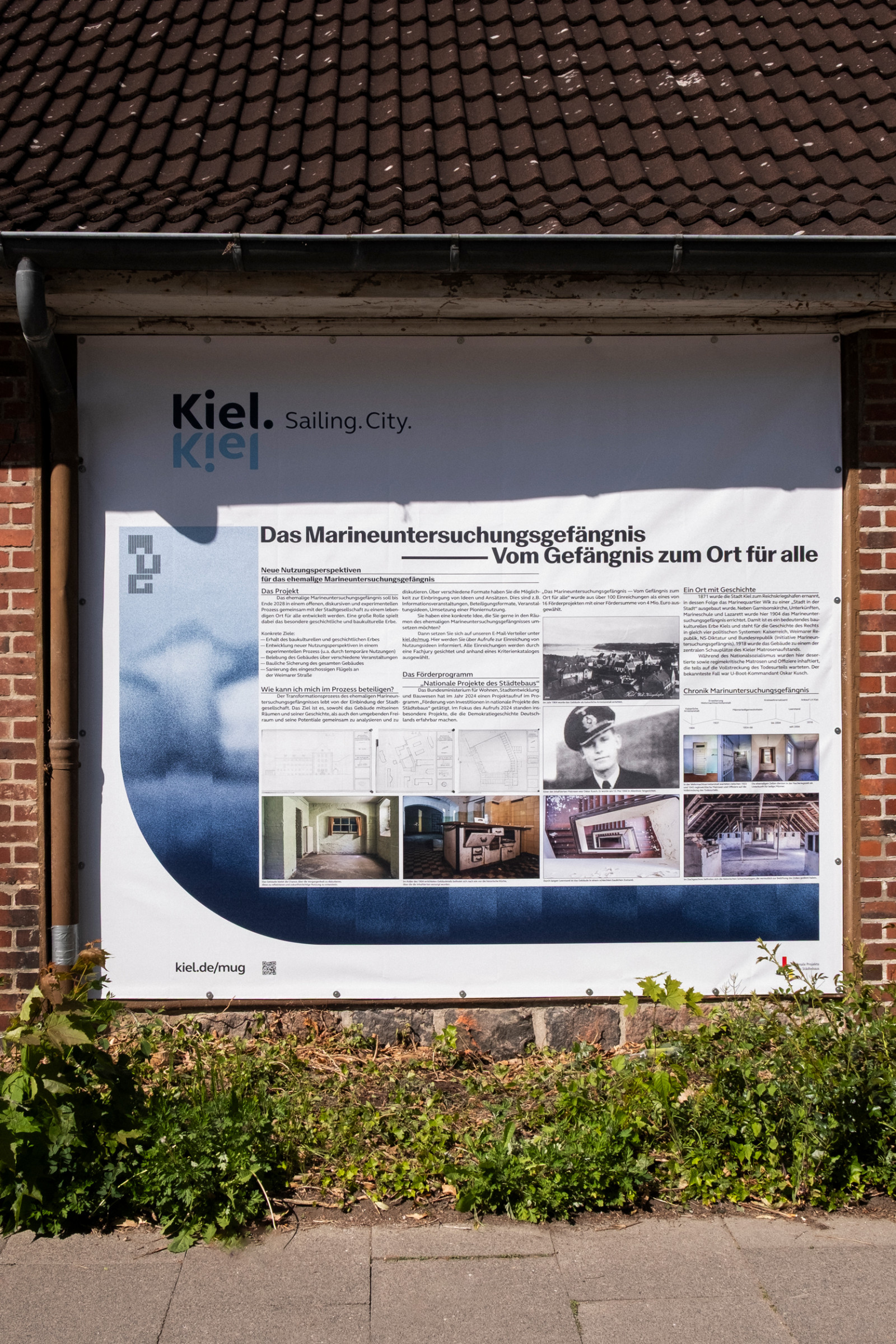
The city Kiel developed a concept for the further development of the former naval prison in Kiel-Wik: The aim of the project is to develop a long-term perspective for the future use of the historic building based on an experimental and innovative approach.
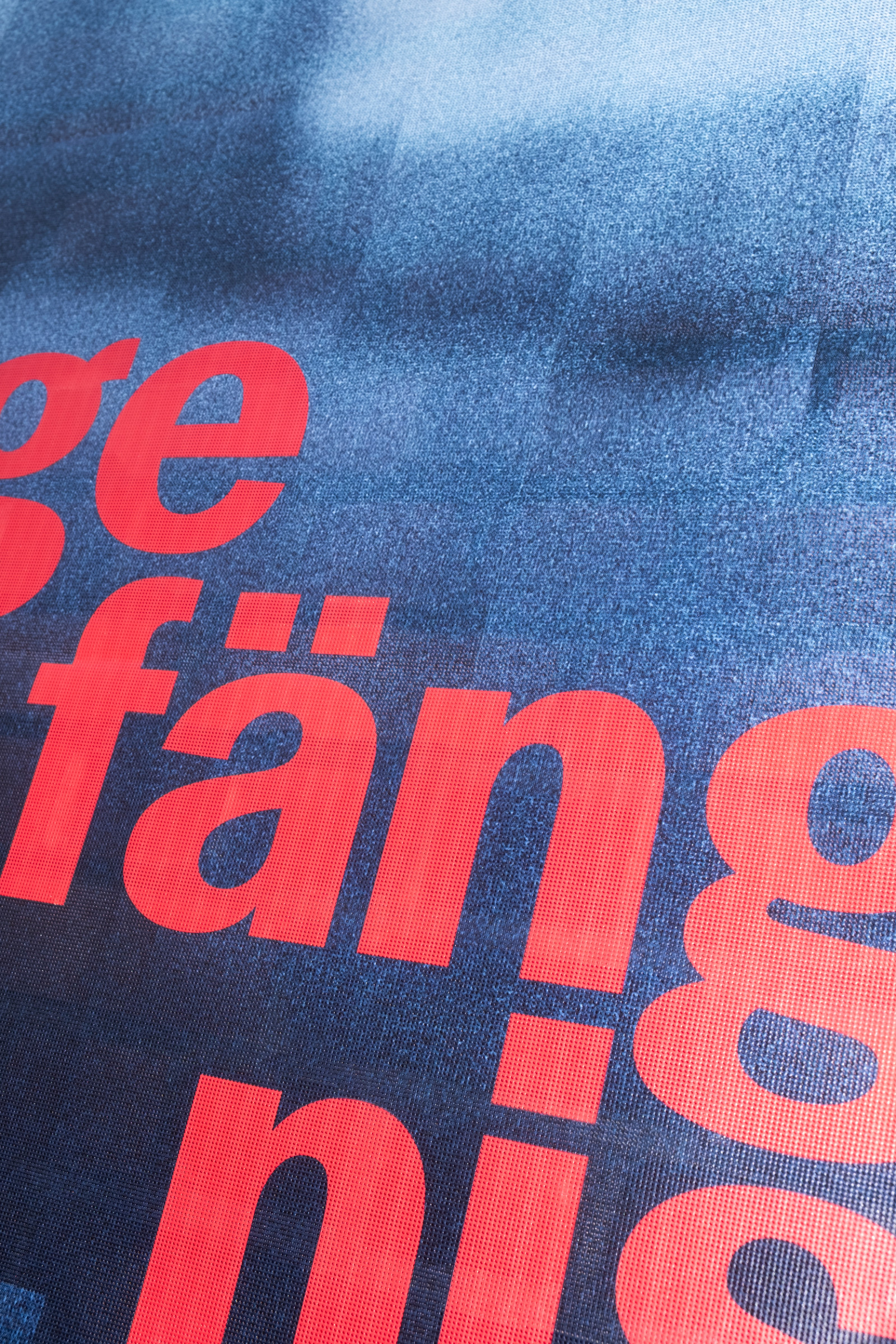
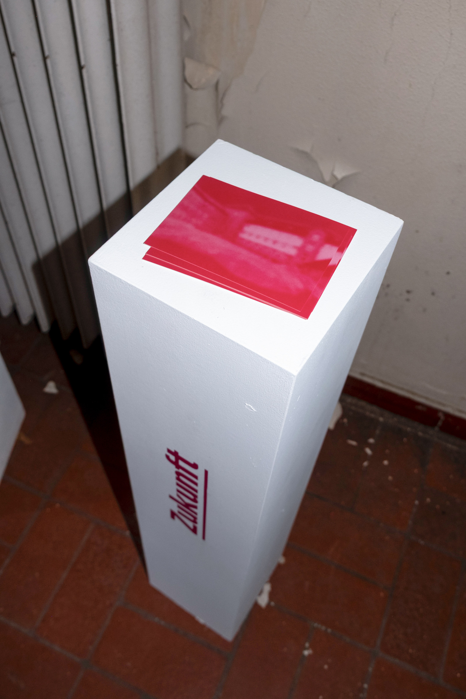
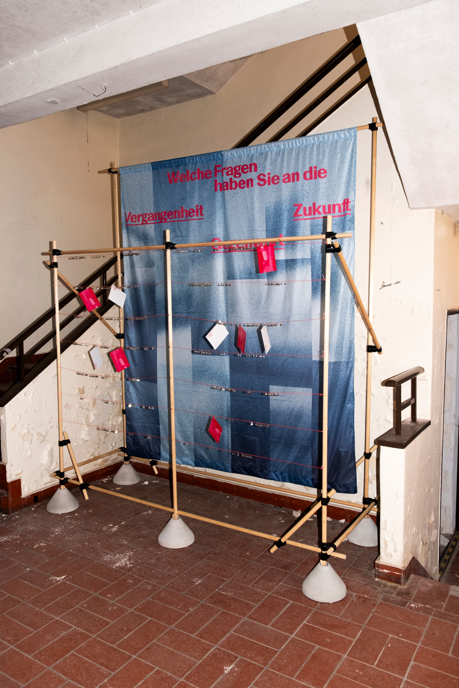
A logo was created to reflect the architectural design of the former prison. The letters MUG were given a geometric design and abstracted using vertical lines. They convey a sense of transparency while also evoking the image of prison bars. As part of the opening, banners and information posters were designed that show the old prison in an abstract form in order to represent a forward-looking break with the past. The blue refers to the dark history of the place while the saturated pink brings modernity and change. The choice of font underscores this modernity.
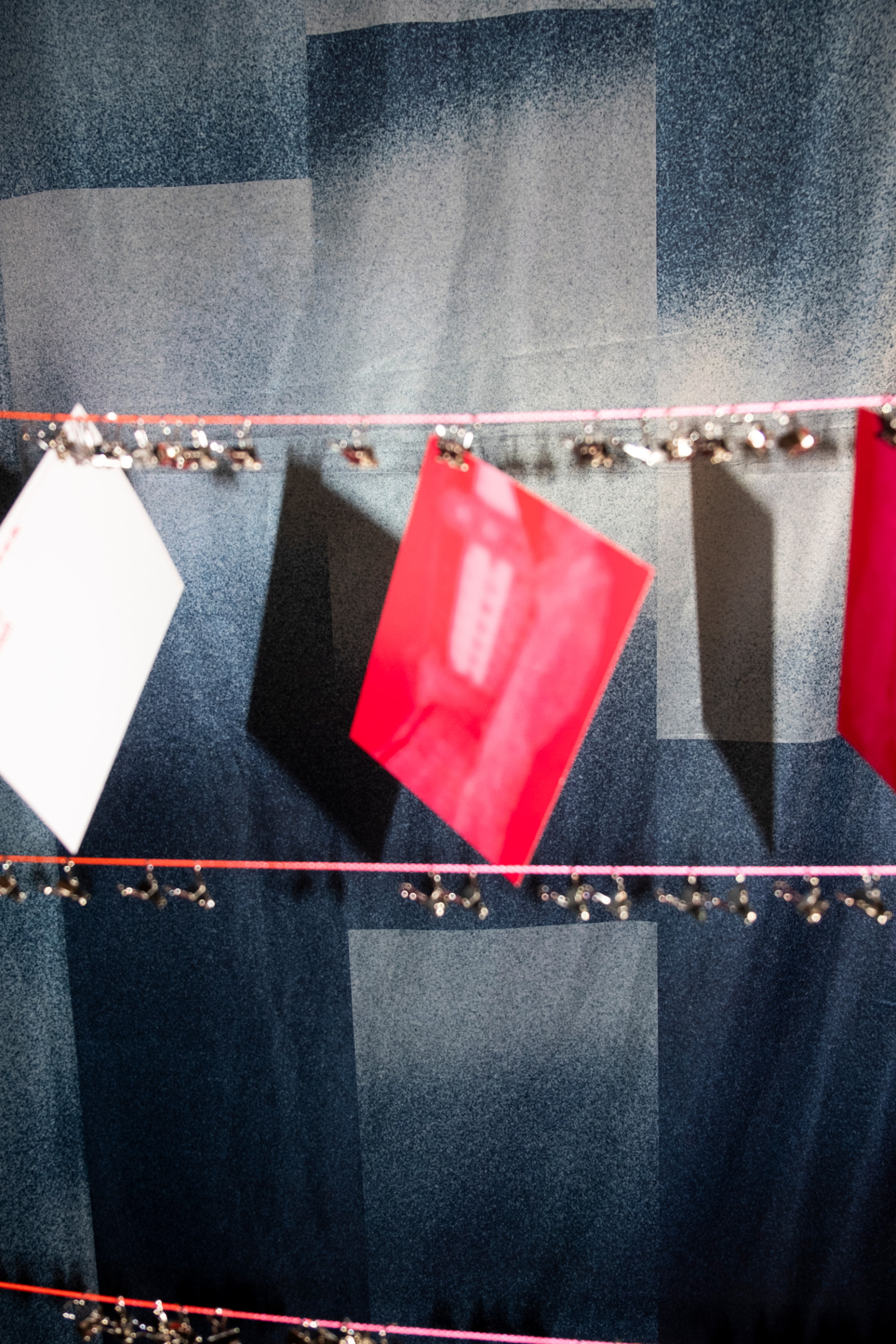
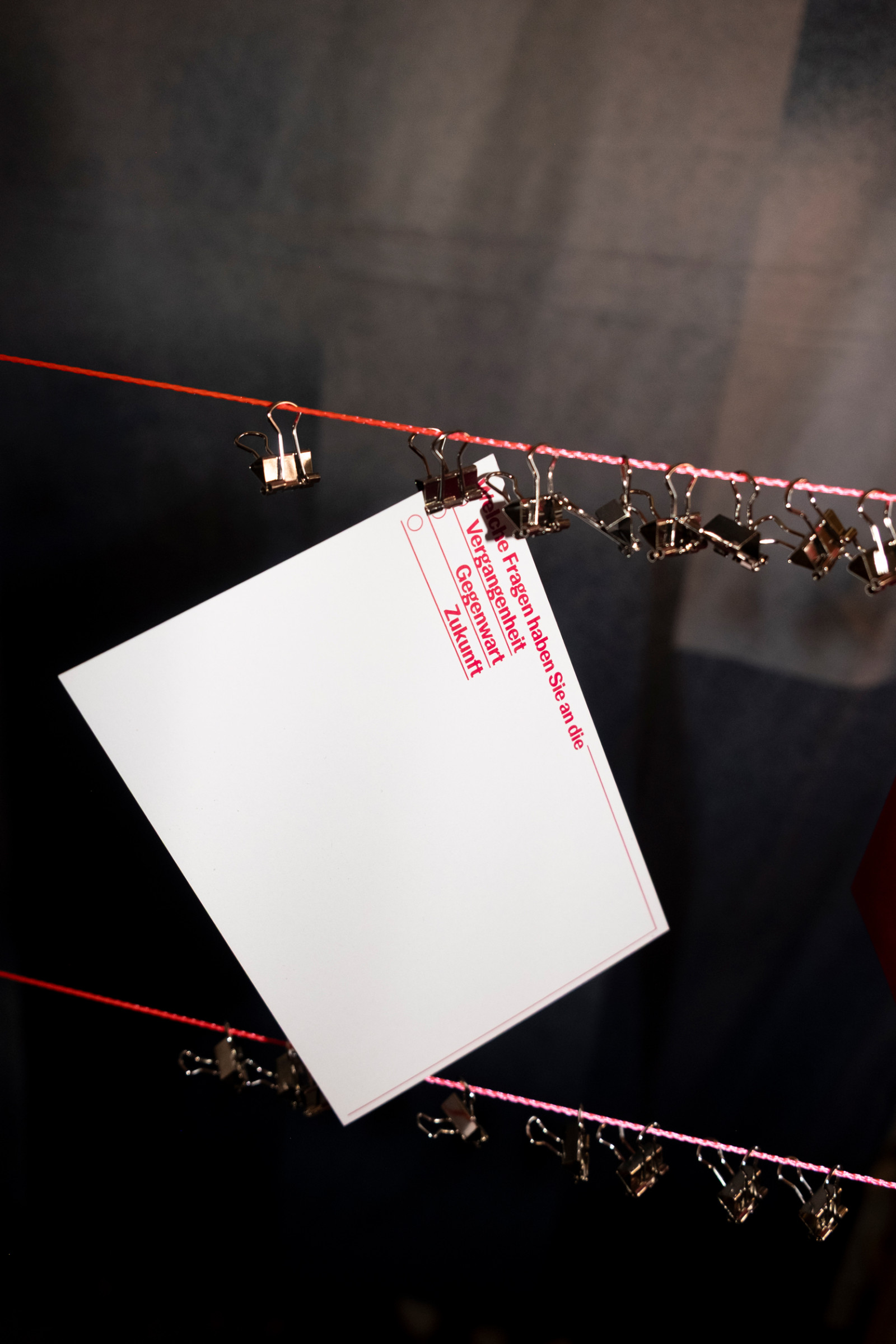
An installation was also created in collaboration with Anja Lilia Cambria Oellermann in the prison’s entrance hall, which encouraged interaction with visitors and recorded their wishes for the future of the building on postcards.
Typeface: Basel Classic by Optimo