068
ReBau
05/2020
05/20
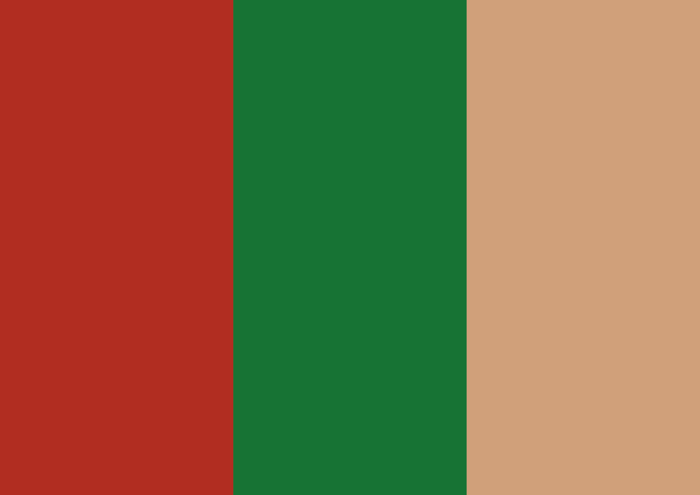
ReBAU follows a paradigm shift and works for a comprehensive resource and climate protection in the construction industry. The logo traces the cycle of reused resources and puts ReBau in focus. Three main colors are used for the corporate identity to emphasize the idea of sustainability and the urgency of the company. In addition, floor plans are used to visually approach the construction industry. The typographic design is characterized by geometrically strong shapes.
Typeface: Work Sans by Google Fonts (Wei Huang)
& Söhne by Klim Type Foundry