

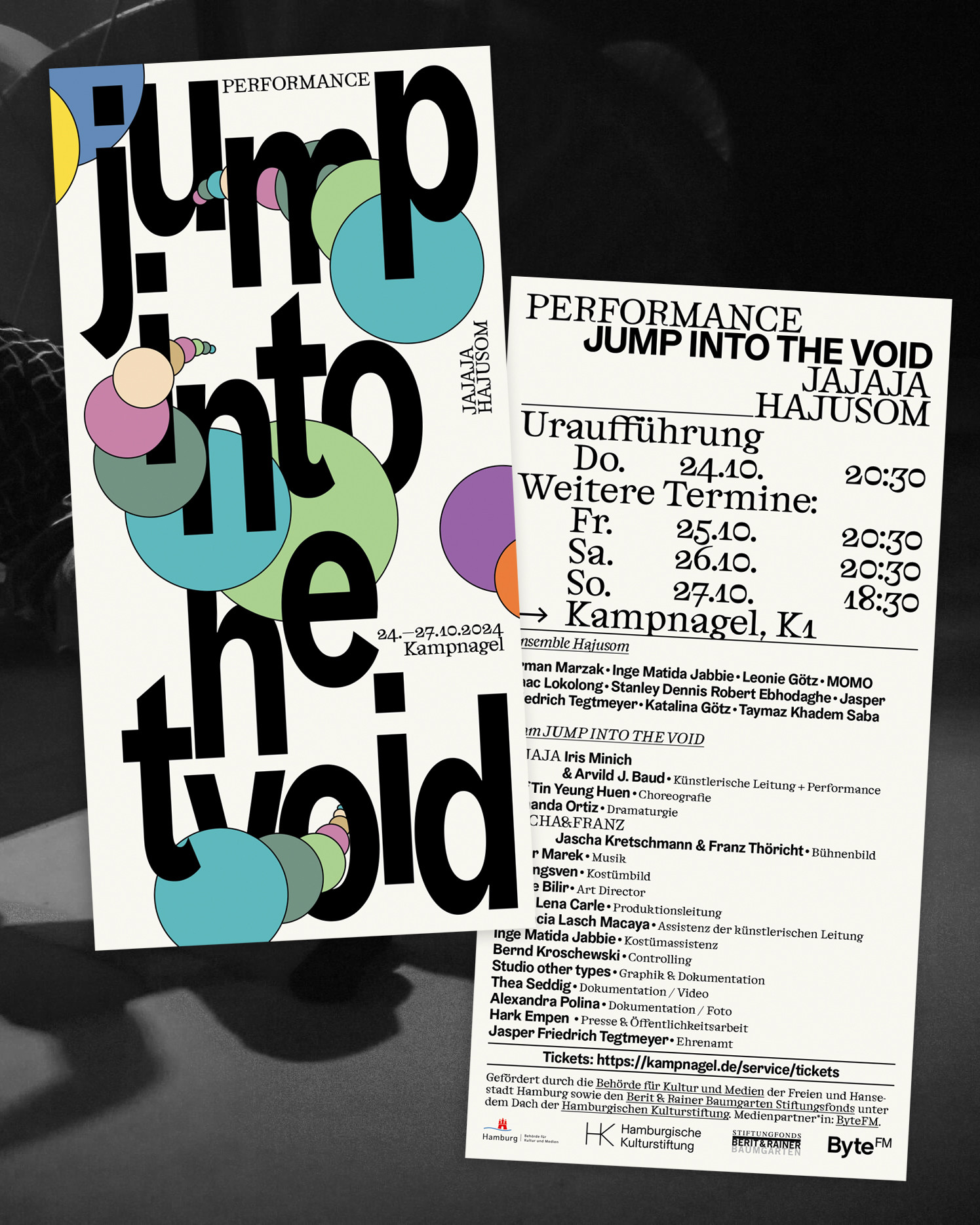
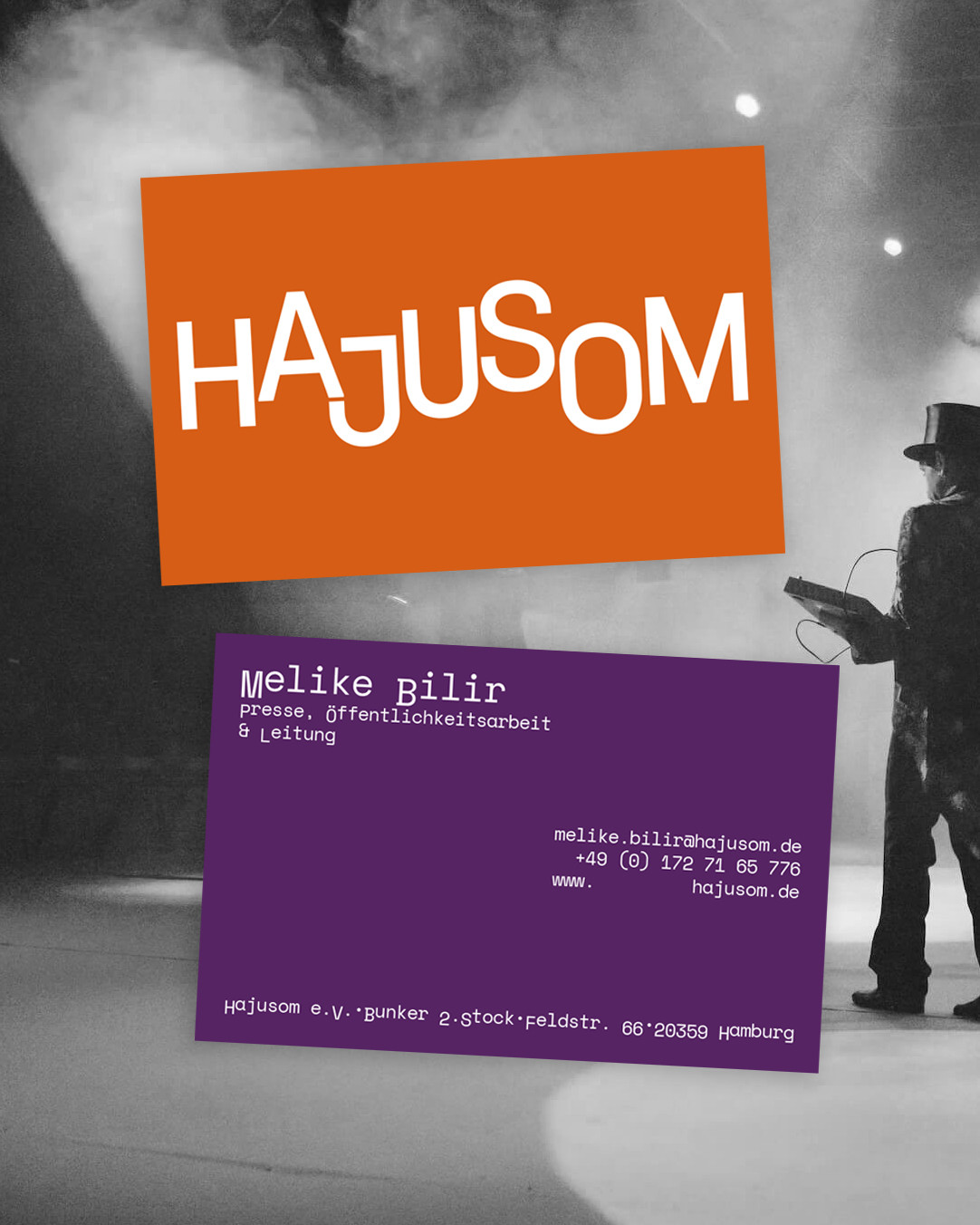

The new visual identity of Hajusom is based on a clear, straightforward design language. The logo consists of a clean, sans-serif typeface, with vertically shifted letters that convey subtle movement and dynamism – a reference to dance, artistic processes, and the constant state of becoming that defines Hajusom.
The colour palette is vibrant and diverse without feeling overwhelming. It highlights the openness and diversity of the organisation, which is active across artistic, social, and educational spheres. In addition to borders and lines, colours visually structure the navigation and support orientation – while simultaneously conveying warmth, openness, and accessibility.
The website is characterised by a clear, visually accessible layout. Key design elements such as a vertically positioned menu, generous white space, and a reduced typographic style enable intuitive navigation. Particular emphasis has been placed on accessibility: high contrast, large font sizes, well-structured text, and a clear visual language ensure the content is approachable and easy to grasp.
The website’s content is available in multiple languages. Visual requirements for right-to-left languages (such as Arabic) have also been considered, further underscoring Hajusom’s transnational orientation on a visual level.
Photographic content is atmospherically integrated and documents the organisation’s artistic work in a vivid and approachable manner – without overwhelming the site’s structure. These visuals create emotional connections and lend the website authenticity.
Typwfaces: Cabinet Grotesk by Indian Type Foundry & Space Mono by Colophon Foundry
Code & Implementation: Joscha Brüning & Benjamin Aleuys Unterluggauer