

Klangkosmos is the new club festival for bands from Hamburg.
Each evening, three acts perform across three Hamburg clubs in a series of moderated events
Klangkosmos Hamburg aims to strengthen, showcase, connect, and celebrate the local scene.
The festival is organised by Sebastian Król (Backseat / Fanklub / Norden Festival / Karwendel) und Wiebke Kruse aka Betti Kruse.
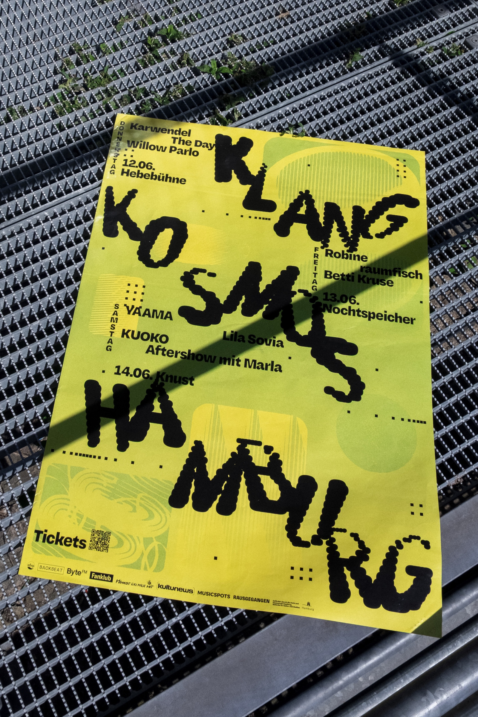
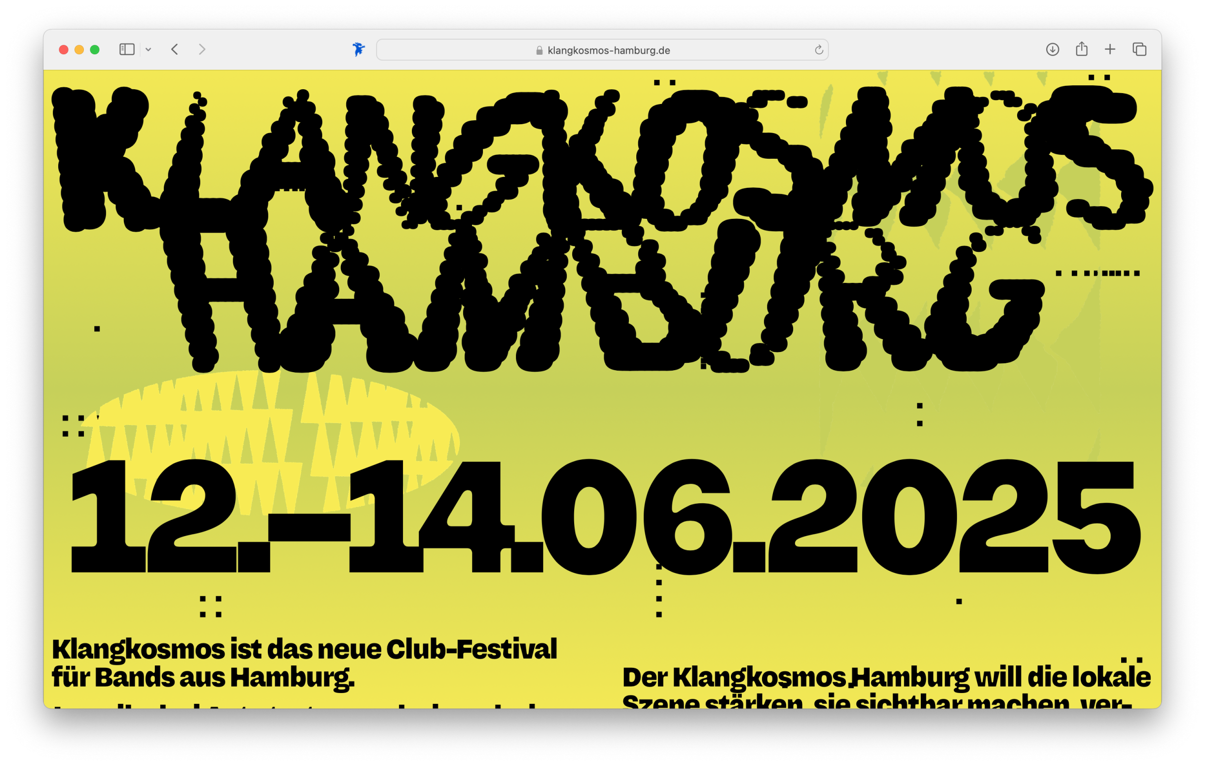
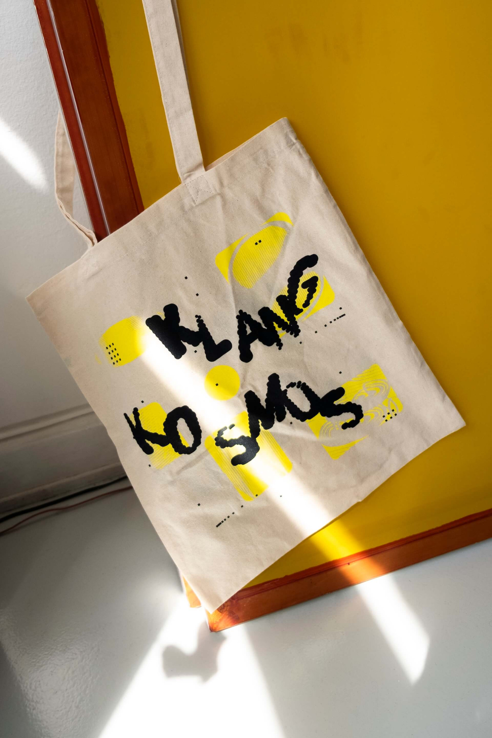
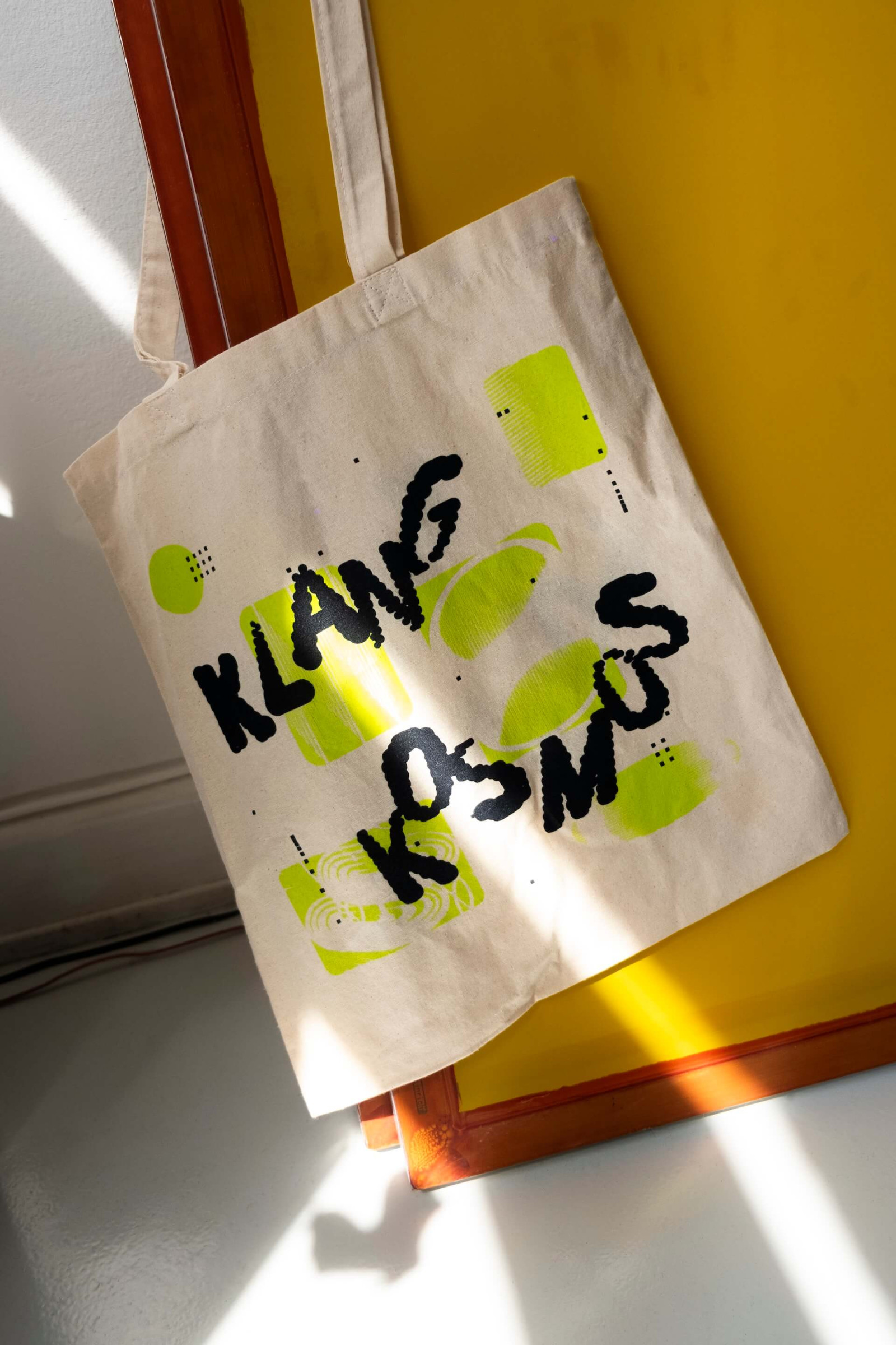
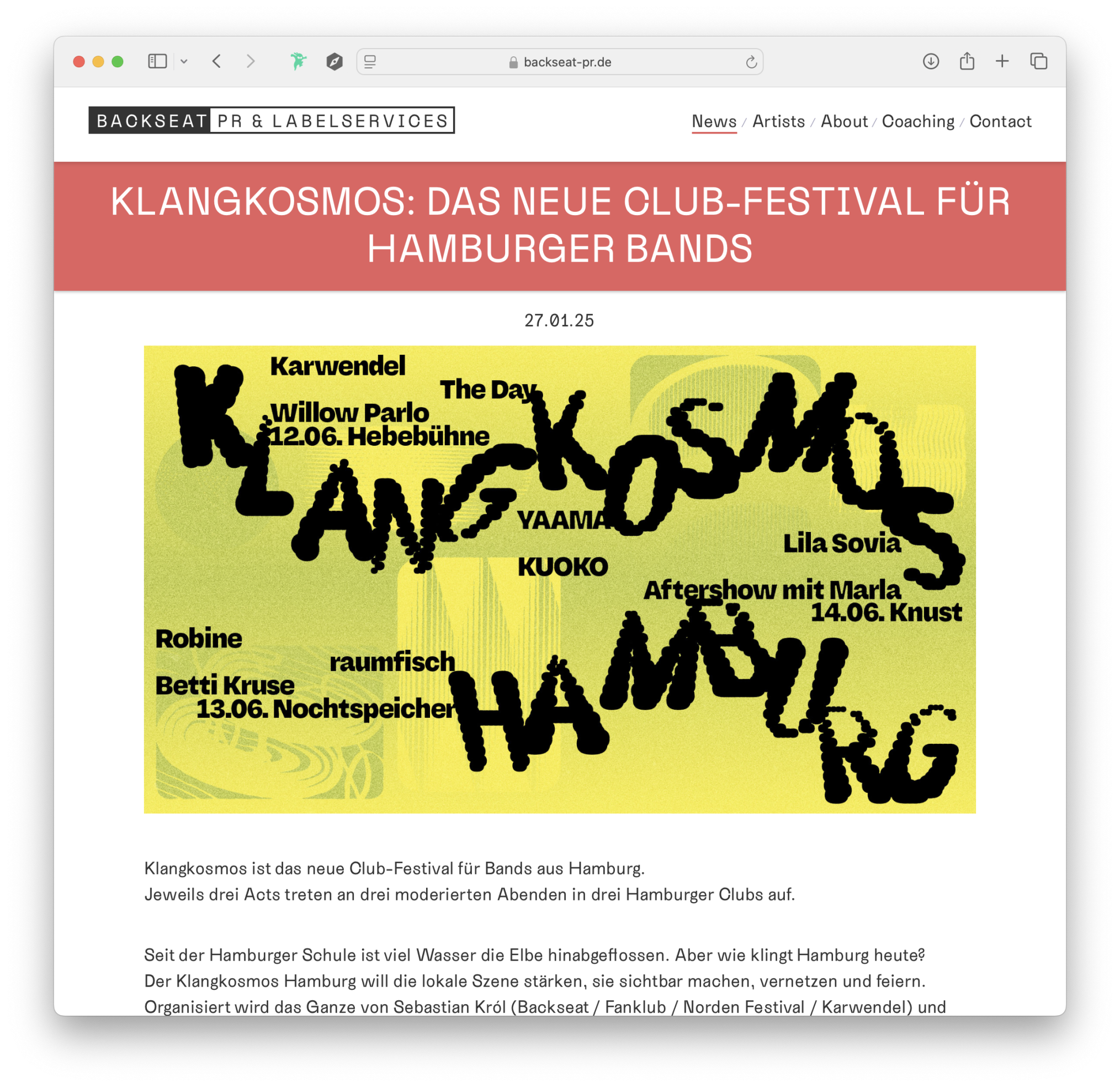
At the heart of the visual identity stands the logo, developed using the variable font Harber by Benoît Bodhuin.
The numerous design axes of the typeface create a playful, multifaceted logo, with each letter distinguished by fine dot structures. This conveys a lively, resonant dynamic.
Graphic elements, reminiscent of the physical visualisation of sound waves, complement the visual appearance and emphasise the theme of sound.
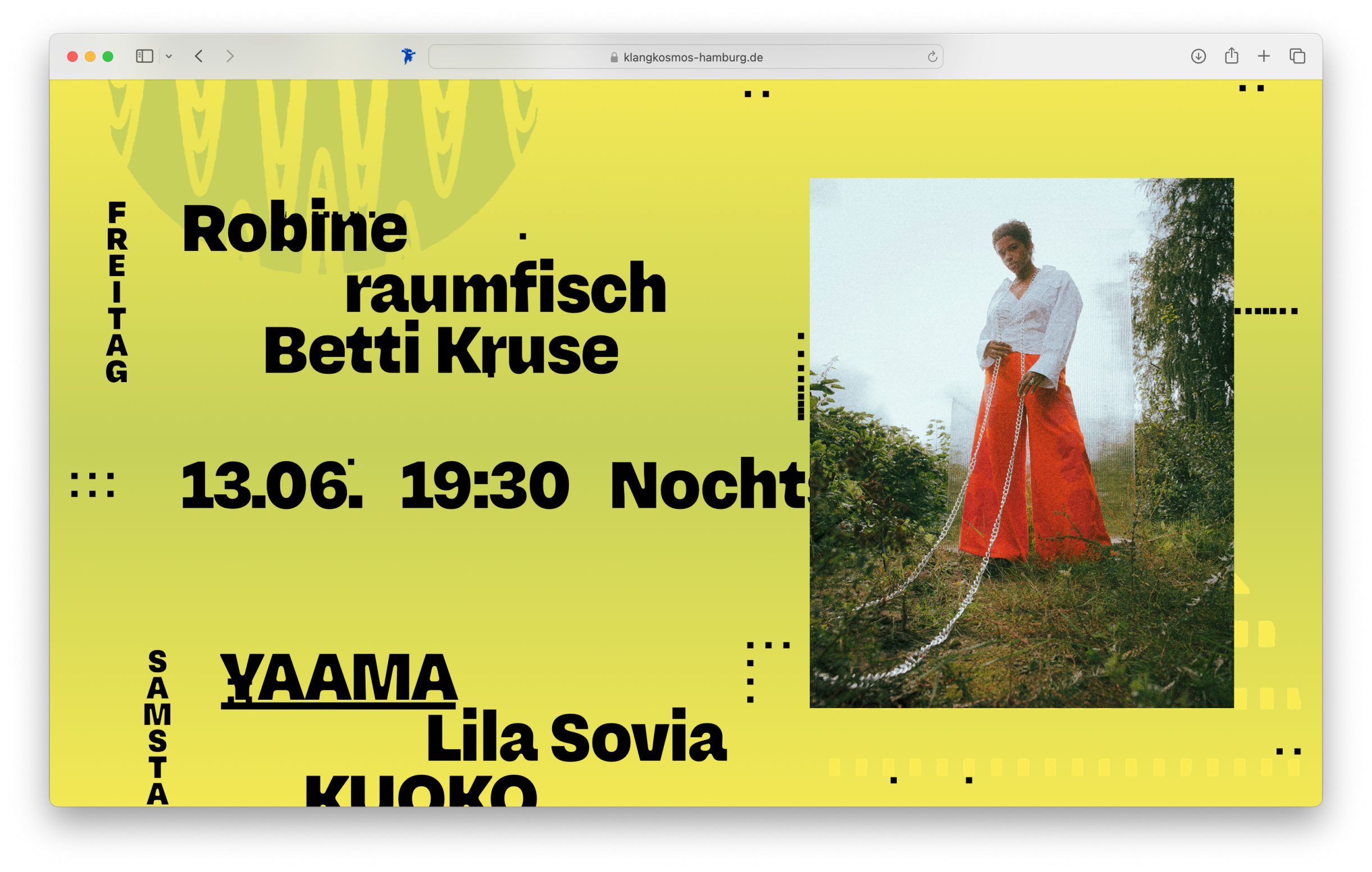
The colour palette ranges from bright yellow to vibrant green. A noise filter lends the colours additional depth and complexity.
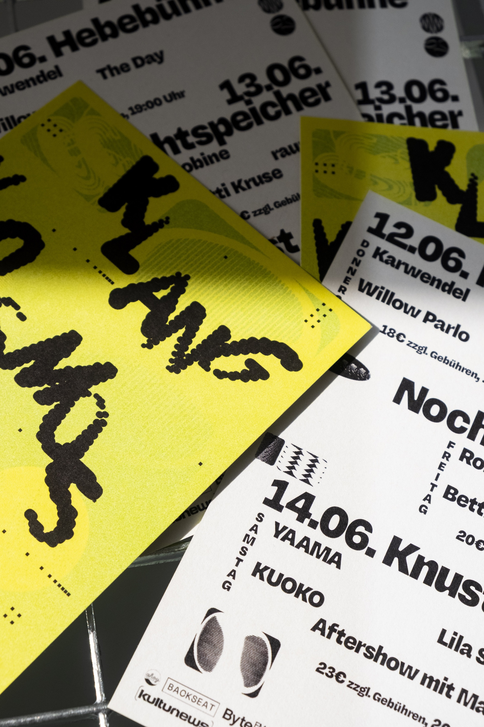
The accompanying typography, set in Gantry by Oh No Type Co., adds a soft, inviting feel to the design. Its varied letterforms reflect the festival's musical diversity.
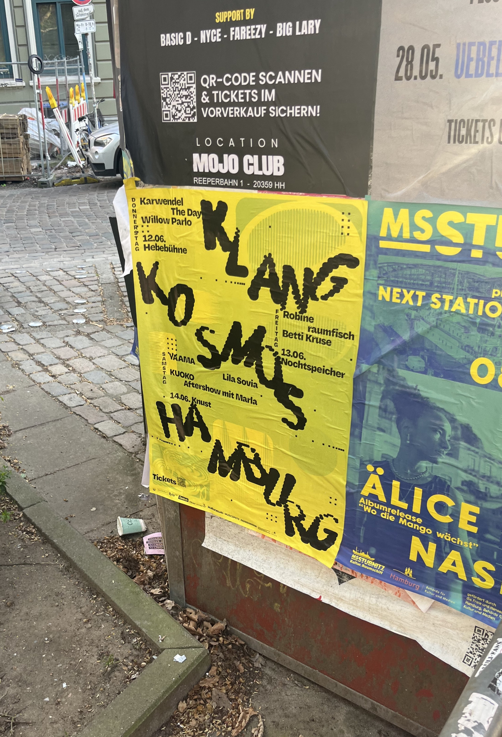
In addition to the core corporate identity, the following materials were developed: logo, poster, website, flyer, promotional items (tote bags, temporary tattoos), and digital assets for social media and online media.
Typeface: Harber by Benoît Bodhuin & Gantry by Oh No Type Co.
