


The cover image appears raw and unpolished, yet deliberately staged – a visual balancing act between authenticity and stylised pose. The back of the album is loud and uncompromising: image and text overlap in a deliberately chaotic layout, reminiscent of the visual language of the early 2000s.
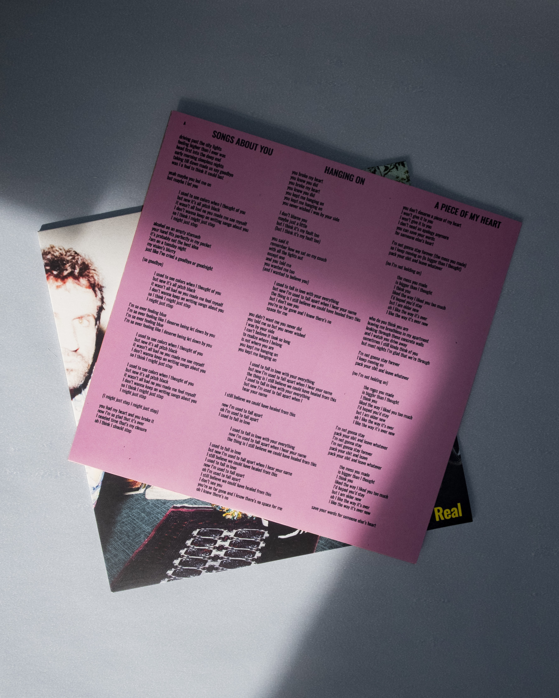
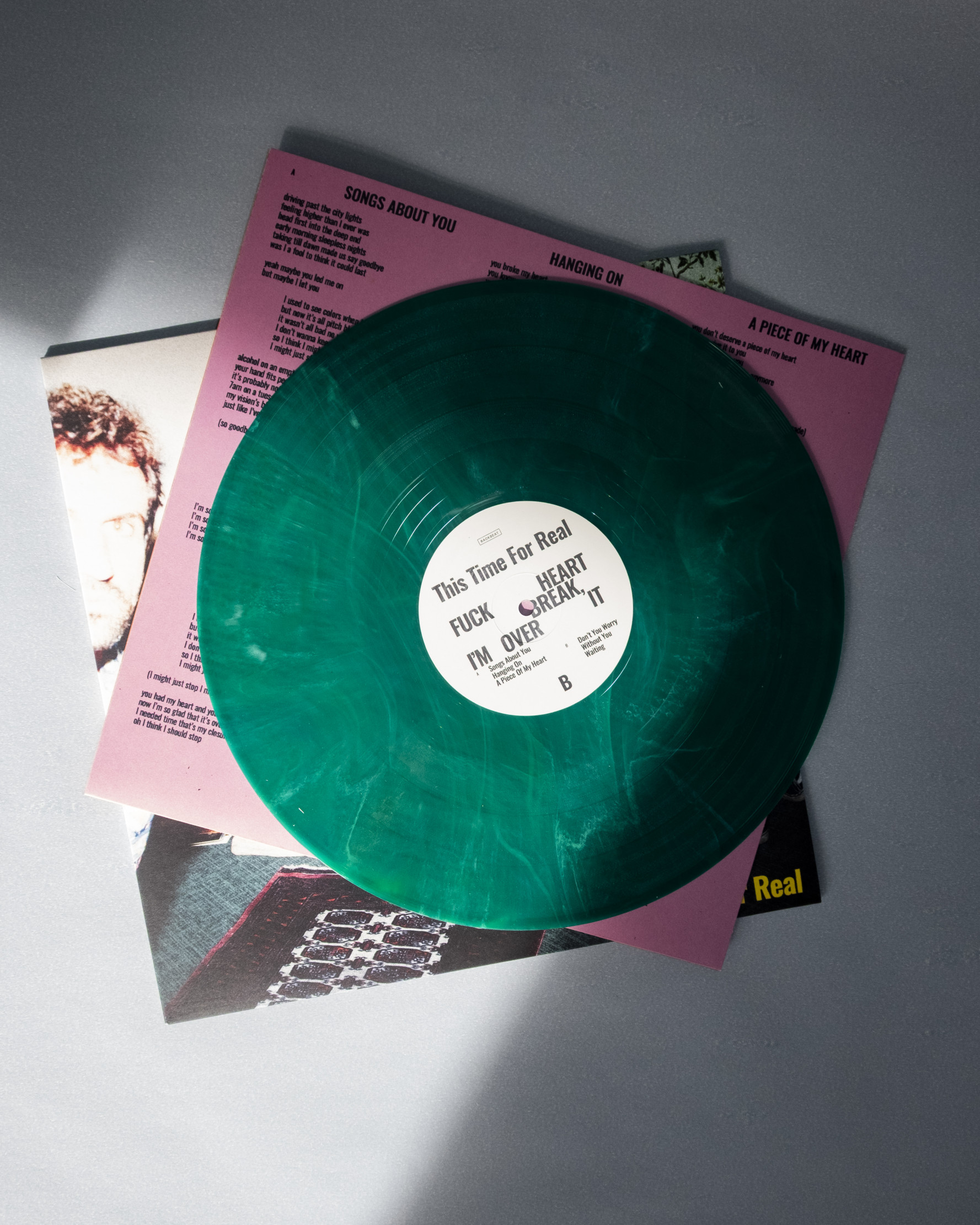
The inner sleeve is printed in two colours – orange and pink – and features the song lyrics. The colour choice feels unconventional yet coherent; a successful nod to the design trends of the time. The record itself is pressed on green and black vinyl, with a label bearing a subtle pattern that was widely used around the turn of the millennium.
The overall colour scheme is derived from the tones of the cover photo, resulting in a cohesive and carefully considered visual identity. The design feels like a unified whole – raw, expressive, and confidently situated between nostalgia and the present.
The Album was released on Backseat.
Typface: Oswald by Vernon Adams